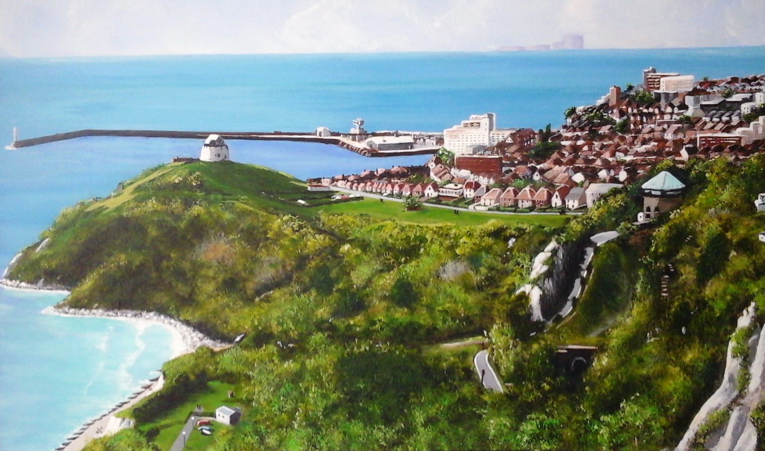
The Warren, Folkestone
Accepting a commission is a double-edge paintbrush. There’s the thrill of someone (a complete stranger) liking your work so much they want a special piece to hang in their home, whilst on the opposite side is the worry, the fear of letting that person down, being unable to come up to their expectation. Would they like it? Is it the sort of thing they wanted? Could I have done it better or differently? …all the angst of being an artist. With most of the commissions I’ve accepted, the subject matter has been left very much open, with requests such as “I want something that has lots of pink flowers?” or “Will you paint me a woodland scene full of autumnal reds and oranges?” being the more usual approach. Thus, perhaps you can understand the challenge of painting something more specific after I was fortunate to secure a recent commission to paint a landscape from a photograph taken by a new client: a view across to Folkestone, England from an area I later found out was called the Warren.
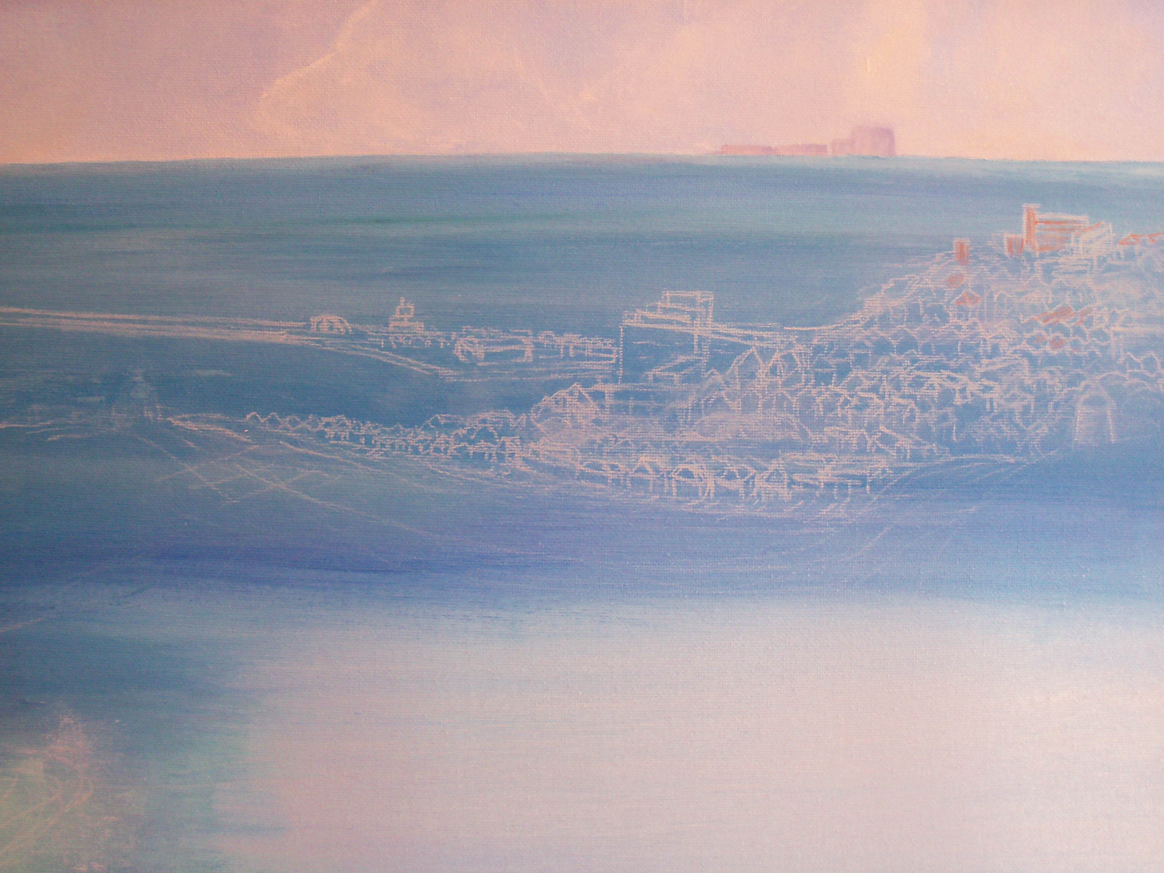
Original supplied photograph:

As I wasn’t familiar with this part of the country, I spent many hours on the Internet and Google Earth, studying various images of the region in order to familiarise myself with the location. However, it is difficult to get any feel for a place from a photograph – one needs to see, smell and feel the atmosphere of an area in order to bring it to life and do it justice – so I was very much working in the dark. There was also the dilemma of what to include and what to leave out, bearing in mind my client’s requirements, in order to create a more pleasing landscape. In this instance, I’d decided to omit many of the telegraph poles and wires that criss-cross the foreground and the tree bottom left, along with several communication masts on jetty near the hotel (the large white building just off-centre mid distance) – the artistic licence bit. There is also the quandary of how true to life one paints from a photograph: the lighting, the time of year, etc.
The first step was to grid the photograph in order to transfer the image to an 60 x 40 cm (A2) box canvas, choosing a 10 x 6 grid. I find this easiest when including a lot of detail, particularly buildings. Using a soft pencil, I marked the canvas at its edges, then drew in the vertical grid. The ruler was not long enough to cover the width of the canvas so I resorted to using the edge of another same-sized canvas to draw along. The second horizontal line down was well placed as this provided the perfect horizon line approximately one-third the depth of the painting. This exercise was repeated on A4 canvas paper to help when deciding on the palette of each part, testing colours, and as a reminder of what goes where.
Photograph with grid:

Once happy with the sketch, I erased the grid lines, with the exception of the horizon line, which I masked off to provide a level edge to paint to. In the original photograph, the clouds are not well defined, being a wishy-washy one colour blue across the complete width. To give more life and depth to the sky, I painted in various banks of clouds sweeping in, without drawing too much attention to them. Although not clear in the supplied photograph, on the horizon to the right is Dungeoness Power Station. My client had requested specifically that this was to be included, so I painted in this, slightly larger than real life to make it more visible, before carefully removing the masking tape once the paint was completely dry. Another strip of tape was then place above the horizon line in order to paint in the sea – the English Channel.
When this was dry and the tape removed, I determined on the vanishing point in the picture and drew in perspective lines with a white pastel pencil. Using these lines I then roughly sketched in the buildings and the jetty. Because the scene has various directions for the eye to travel along – horizon, mid distance and downward to the camp site in the bottom left-hand corner – these lines proved invaluable in getting the right view right. Using a pastel pencil also means any part can be readily rubbed out, repositioned and redrawn; far better than using a lead pencil which can smudge and often shows through any paint, particularly white. (Please note that the horizon in the photos appears curved – this is due to an effect created by my camera. Rest assured the picture doesn’t depict the Earth’s curvature, it is level. Also, the colours depicted in these photos do not give true justice to the actual painting – again a fault with the camera and my probable lack of photographic prowess!)
The picture was slowly built up, layer by layer, building by building, although not being a slave to the photograph and not including every single house or tree in mid distance.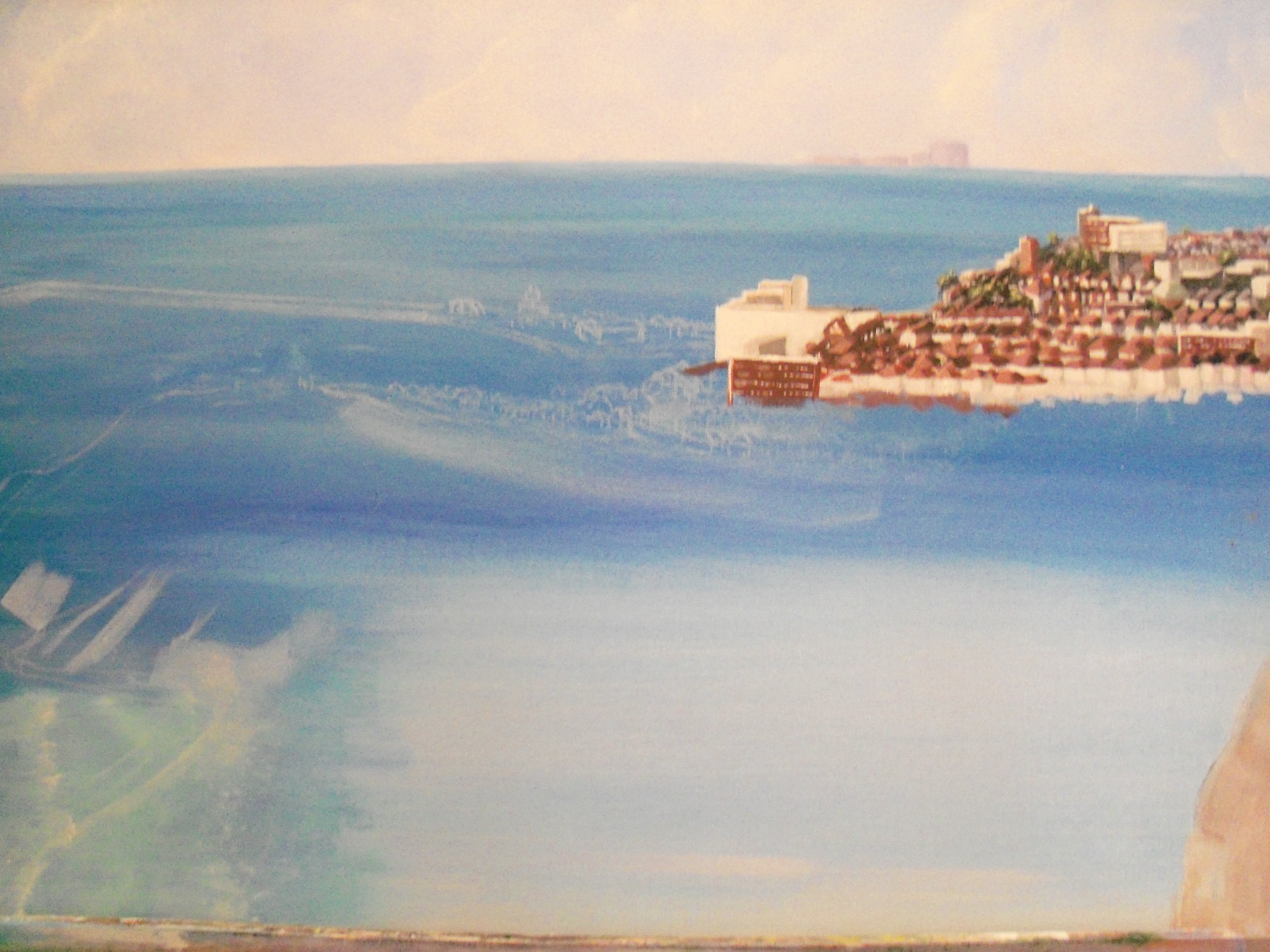 Slowly, each level was created, adding in the jetty and quay, before underpainting the green on the cliff top, along with the contours and outlines of the foreground. During this process,the top and bottom and side edges of the canvas were also painted, wrapping the scene around so that the canvas could be hung with or without a frame, depending on the owners’ preference.

Next, the two martello towers, the lighthouse, the green with its parking area, cars and clubhouse, the trees and shrubbery down to the sea, the promenade and breakwater, and finally the campsite with its building, camper vans, fence, people and lampposts were added. Again, these were first drawn in using a pastel pencil until I was fully happy with their placements and size in relation to the surroundings before painting in, complete with shadows.
The hardest part of any painting is knowing when to stop, when to stop fiddling, as one wrong stroke, one extra line can ruin the whole thing so before I reached that point, the painting was signed. Done!
The final painting: The Warren, Folkestone
Duly finished the work was delivered to two very happy clients, who welcomed me into their lovely home, and discussed over coffee where they were going to hang the canvas, and where I also learned the background to their wanting this painting and what it meant for them.
Whilst in Kent, I was also privileged to be given a guided tour around Folkestone, observing and learning about many of the buildings within the painting, and also taken up to the Warren, to the view point where the original photograph had been taken from, to experience for myself the whole panorama. Breathtaking, despite being a dull, blustery and drizzly October afternoon. up on the cliff top at the Warren, but I like to think I had captured the area well in my work, and I like to think my clients feel the same. Thank you Dave and Marion for the opportunity, and to Anne and Alan for being my host and for introducing me to two new friends of Kit Domino Art.
NOTE: All photographs and images have been used with kind permission from my client.

One Response to “The Warren, Folkestone”
Stunning! You are truly gifted. xxx